AI visualisation · 26 Aug 2026
Exterior vs Interior Visualisation for Developments
Oracreative · Updated 20 July 2026
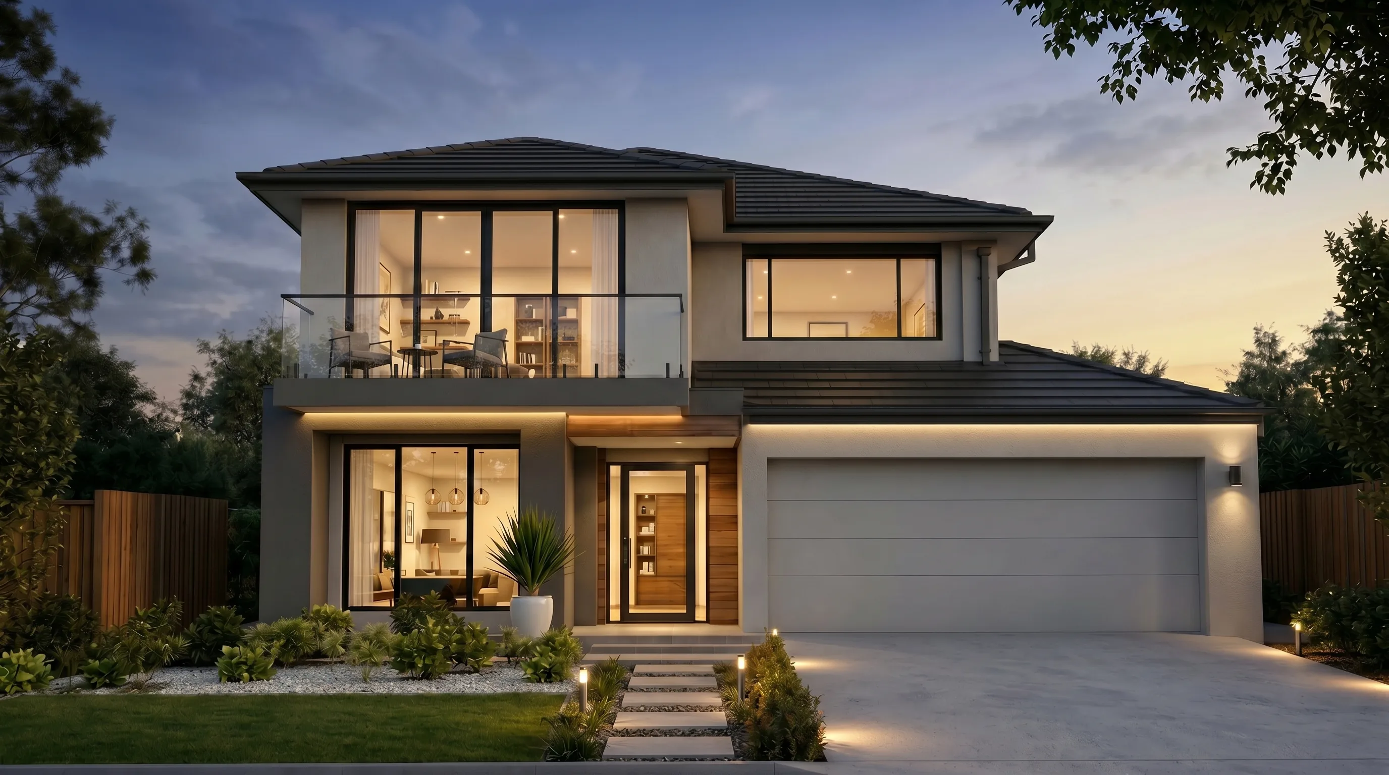
Every property launch reaches the same fork in the road. Do you sell the building, or the life inside it? Exterior vs interior visualisation is how I frame that decision for a development. The exterior sells arrival, scale, and street presence. The interior sells the feeling of actually living there. Get the balance wrong and even a strong project can land flat.
I have spent about three years making video, and homes are where I settled. These days I build these visuals with AI. I run Oracreative, a Sydney studio, and I have made every piece in our portfolio myself. So I will skip the sales talk and be plain about what each type of image does well. This guide covers what the exterior job is, what the interior job is, when to lead with which, where each falls short, and how to brief both for one launch.
Exterior vs interior visualisation: two different jobs
People often treat these as one deliverable. They are not. They do different emotional jobs, and they fail in different ways. An exterior visual answers a simple question in a buyer's head. Would I be proud to arrive here? It carries the address, the form, and the first impression. It is the cover of the book.
An interior visual answers a quieter question. Could I picture my life in this room? It is about morning light, the flow from kitchen to living, the reach of a view. It is the story once the cover has done its work. Both matter. But they rarely carry equal weight on the same project.
This is the same craft I apply across every AI property video and still. The tools are shared. The judgement is not. Knowing which image should lead, and which should support, is most of the value. A generic package that treats a beach house and a city studio the same way wastes the strongest asset each one has.
So the real question is never "exterior or interior". It is "which one opens, and how much room does the other get". That call changes with the product, the buyer, and the channel. The rest of this guide is how I make it.
What exterior visualisation has to nail
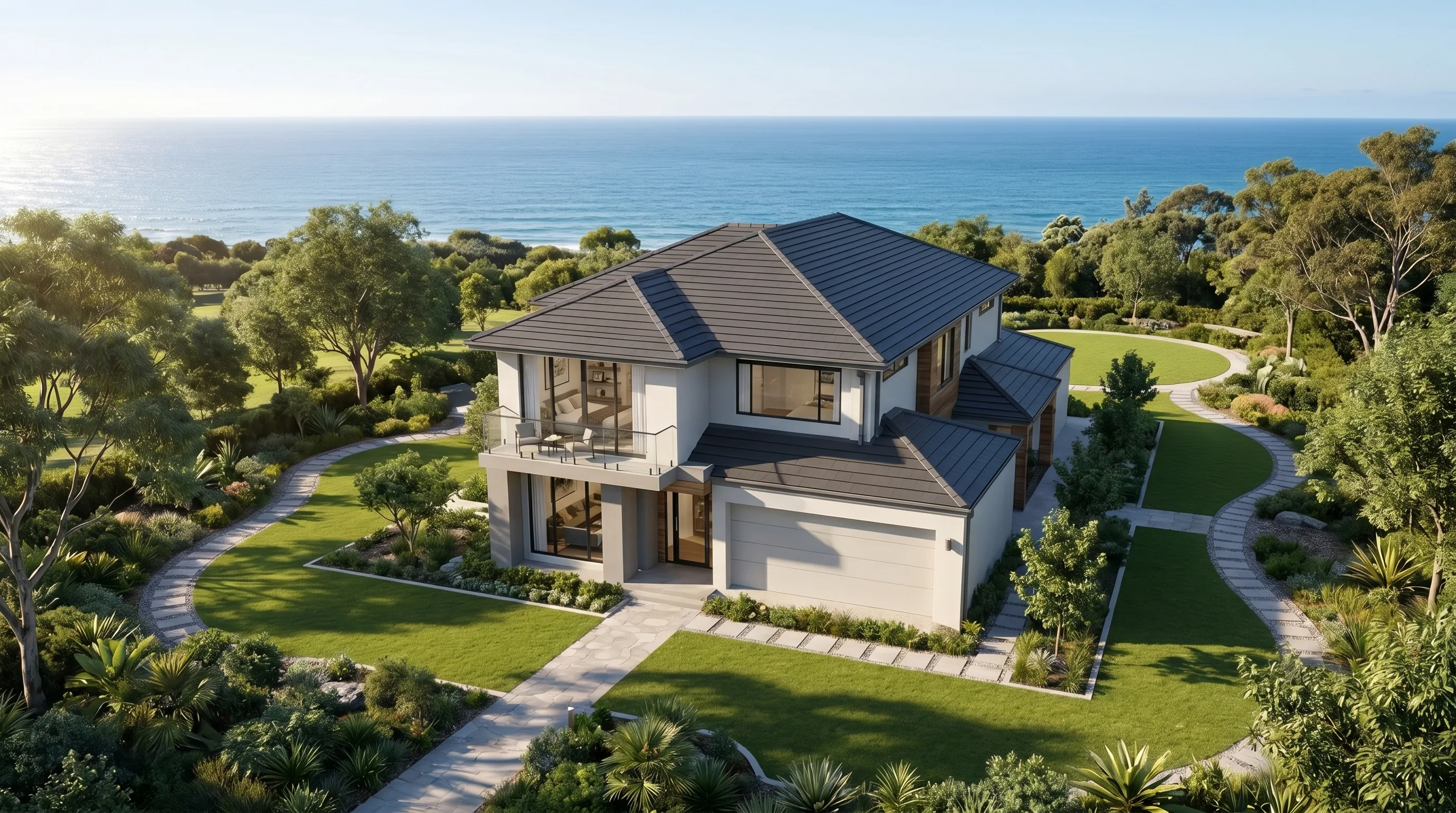
An exterior visual has three hard jobs. Light, materials, and context. Miss any one and the image feels fake, no matter how clean the geometry is. Light comes first. The angle of the sun sets the whole mood. A flat midday render looks like a catalogue. A low, warm light gives a facade weight and shadow. That is what makes render feel like a photograph.
Materials come next. A rendered brick, a timber batten, a metal roof each catch light differently. Get the reflectance wrong and the eye knows, even if it cannot say why. So I match the finishes to the real schedule, then push the lighting until the surfaces read as real. The point is texture you could almost touch.
Context is the part people forget. A house is never just a house. It sits in a street, a suburb, a landscape. The aerial above works because the ocean, the garden, and the paths tell you where you are. Strip the setting and you lose the sell. For a location-led project, the exterior is doing most of the marketing on its own.
Time of day is a real choice, not a default. A dusk shot with lit windows sells warmth and lifestyle. A bright morning shot sells the landscaping and the space. I often make both from the same build, so a campaign can lead with one and support with the other. An aerial adds a third read again, placing the home in its whole setting.
Exteriors also carry scale in a way interiors cannot. A two-storey form, a wide frontage, a considered roofline. These signal quality before a single room is seen. That is why a house-and-land or a boutique development usually opens on its exterior.
What interior visualisation has to nail
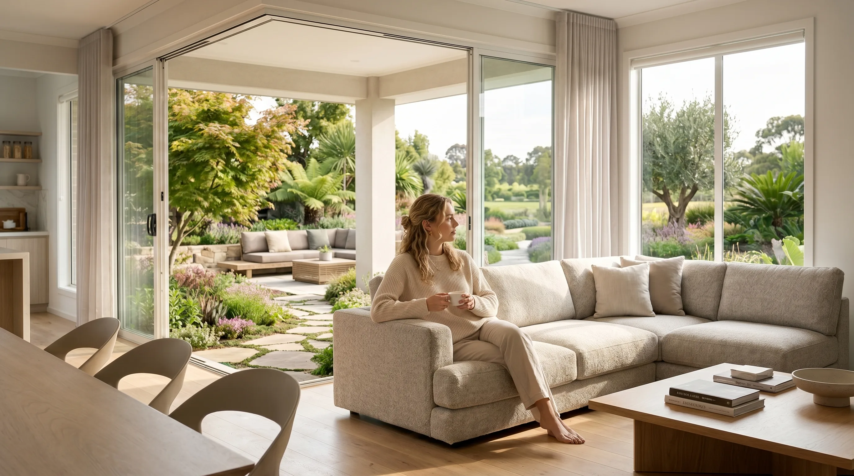
Interiors run on different rules. The three jobs here are proportion, styling, and the view out. Proportion is the one that catches people. A room that is a touch too tall, or a sofa that is slightly too big, breaks the spell instantly. So I set the geometry from the real floor plans and elevations first. Ceiling heights, window positions, and sightlines all come from the drawings, not from taste.
Styling does the emotional work. The furniture, the palette, and the small props tell a buyer who this home is for. A downsizer's living room is dressed differently from investor stock. I match the styling to the target buyer, not to a trend I happen to like. The room in the image above sells calm and light, which suits that home.
The view out is the quiet hero. A window is not just glass. It frames a garden, a courtyard, or a skyline, and that borrowed scene lifts the whole room. In the still above, the open garden doubles the sense of space. For apartments especially, the aspect and the outlook are half the product. So the interior visual has to sell them honestly.
Lighting inside is its own decision, just as it is outside. A soft daytime scene reads open and airy. A warm evening scene, with lamps on and a set table, reads intimate. The mood you choose should match the buyer and the room. A family kitchen wants life and light. A main bedroom can afford calm and shadow.
Interiors also carry layout and flow, which floor plans alone cannot. A buyer feels how the kitchen opens to the living zone. They sense whether the space breathes. For small footprints, a well-made interior is the single most persuasive image in the whole kit.
When to lead with which
The choice comes down to three things. The product, the buyer, and where the image will run. Some projects sell on presence. A coastal home, a house-and-land package, or a landmark building leads on its exterior. The arrival is the story. Others sell on lifestyle. A city apartment, a compact townhouse, or a downsizer product leads on interiors, because the life inside is what a buyer is really buying.
The buyer sharpens it further. An owner-occupier imagines living there, so interiors pull hard. An investor often buys on numbers and a feeling of quality, where a strong exterior and a clean layout do more. Knowing who you are talking to decides the running order before a single frame is made.
Channel matters too. On portals like realestate.com.au, the lead image is the thumbnail a buyer scrolls past or stops on. That first frame has to earn the click, so it is chosen with care. The same logic runs across Domain and social, where a scroll-stopping exterior or a warm interior can decide whether anyone looks further. So exterior vs interior visualisation is partly a channel decision, not only a taste one.
The table below sums up how I weigh the two across common project types. It is a starting point, not a rule. Every launch gets its own call.
| Consideration | Lead with exterior | Lead with interior |
|---|---|---|
| Product type | House-and-land, coastal, landmark builds | Apartments, townhouses, compact stock |
| What it sells | Arrival, scale, street presence | Lifestyle, layout, light, the view out |
| Buyer | Investors and location-led buyers | Owner-occupiers and downsizers |
| Makes or breaks it | Light, materials, and site context | Proportion, styling, and the outlook |
| Best channel role | The portal thumbnail and hero shot | The gallery that holds attention |
Not sure which should lead your launch? Start a free pilot → — one property, both angles, no cost.
Why the two work best together
Leading with one does not mean dropping the other. The strongest launches use exterior and interior as a sequence, not a contest. The exterior opens. It sets the address and the quality. Then the interiors deliver on that promise, room by room. A buyer who is sold on arrival still needs to picture the life inside before they commit.
In a film, that sequence is literal. A slow reveal of the facade, a step through the door, then a drift through the living spaces. I unpack how stills and film work together in my guide to AI architectural visualisation. Stills work the same way in a gallery. The order you place them in is the story you tell.
There is a consistency win too. When the exterior and interior share one visual language, the whole project feels considered. The same light, the same palette, the same restraint. That coherence is what separates a premium campaign from a folder of mismatched images. So even when one clearly leads, I make both to the same standard.
Pairing them also covers every buyer at once. The location-led buyer gets the exterior they came for. The lifestyle buyer gets the room they can imagine waking up in. One kit, two doors in.
There is a reuse benefit as well. Once both are built, the same assets stretch across the whole campaign. Exteriors anchor the portal thumbnail and the billboard. Interiors fill the gallery, the reel, and the display suite loop. You are not paying twice. You are cutting one considered production into every format the launch needs.
The cost and time side of both
People assume interiors cost more because there is more to style. In practice the driver is scope, not category. Price tracks the number of scenes, the level of finish, and the rounds of revision. An exterior with complex landscaping and a full context build can take as long as a suite of interiors. A single hero interior can be quicker than a sprawling aerial.
Because these are built from drawings, neither needs a crew, a location, or a finished building. That keeps both cheaper than a traditional shoot, and it means I can start pre-construction. The saving comes from skipping logistics, not from cutting the craft. The grade, the styling, and the light still take the time they take.
My honest advice is to scope by impact. Put the budget where the sell is. For a coastal home, that is one or two knockout exteriors plus a couple of key interiors. For a city apartment, flip it. Fund the interiors that carry the lifestyle, and keep the exterior to a clean establishing shot. You do not need every room and every angle. You need the frames that move a buyer.
Where each type of visualisation has limits
An honest guide names the trade-offs. Both exterior and interior visuals are only as good as the inputs. Vague drawings and no sense of the buyer produce a generic image, whichever way it faces. And each has its own weak spot.
Exteriors can flatter a site. It is easy to over-light a facade or lean on a view the property does not really have. That is not just poor taste. It is a compliance risk, because the marketing has to match what is actually being sold. Interiors carry the opposite danger. A room styled too aspirationally can imply finishes or a scale the contract never promised. So I flag anything not yet chosen instead of guessing.
There is also a case where a shoot beats a render. If a home is finished, styled, and genuinely photogenic, a good camera can catch texture and spontaneity that a built-from-drawings image has to work to match. I will say so when that is true. You can judge the range and the honesty for yourself across the work I have made. I would rather point you to the right tool than sell you the wrong one.
The through-line is trust. A buyer who feels misled at handover will talk, and in a small market that travels fast. So I treat accuracy as marketing, not just as a rule to clear.
How to brief exterior and interior visuals
You need less than you might think to start. For the exterior, gather the elevations, the material schedule, and any site or landscape plan. A sense of the street and the aspect helps me place the light. For the interiors, gather the floor plans, the ceiling heights, and the finishes boards, plus a clear read on the target buyer.
Then make the call this guide is about. Decide which side leads, and roughly how many frames each gets. Name one person to give consolidated feedback. Feedback from a committee is the most common cause of a blown timeline. A short brief written before the first frame saves the most time of all.
Expect to be involved early, not all the way through. I come back first with anchor frames. The key exterior and one or two hero interiors. You approve that look before I build the rest. Changes then happen when they are cheap, not at the end. After sign-off, most projects need only a round or two of notes.
What you do not need is a finished building, staging, a location, or a big budget. Just the drawings, a clear buyer, and a decision on which door opens the story. That is enough to start, and it keeps every revision focused on craft rather than on re-arguing the concept.
Frequently asked questions
- What is the difference between exterior and interior visualisation?
- Exterior visualisation sells arrival, scale, and street presence — the building in its setting. Interior visualisation sells the feeling of living there — proportion, light, styling, and the view out. Most launches use both, with one leading.
- Should a property launch lead with the exterior or the interior?
- It depends on the product and buyer. House-and-land, coastal, and landmark projects usually lead on the exterior. Apartments, townhouses, and downsizer stock usually lead on interiors, because the life inside is the main sell.
- Does interior visualisation cost more than exterior?
- Not by category. Price tracks scope — the number of scenes, the level of finish, and the revision rounds. A complex exterior with full landscaping can take as long as a suite of interiors, and a single hero interior can be quicker than a sprawling aerial.
- Can you make both before the building is built?
- Yes. Both are built from floor plans, elevations, renders, and material boards, so no finished building, crew, or location is needed. That is why I can start pre-construction and market during the launch window.
- Who owns the copyright to the renders used in the visuals?
- The developer usually owns the source renders and photography. Before I build any exterior or interior visual, I ask for the developer's approval on the rights. Rights first, image second — that order protects everyone.
Planning a property video?
We run a free pilot for a small number of Sydney developers and agencies each month — one property, one finished AI-powered video, no cost.